Aiways
UX / UI for a leading electrical car brand
Hello Aiways France!
As part of my role I was leading an exciting project of introducing a global brand of electronic cars to France.

My Role
Project lead
Research
UI
The Goal
Creating a user friendly categorized website, which will increase engagement and sales.
Global Project
The initial process began with a few video meetings with the client, in order to fully understand the intentions and expectations from the project.
Client
France
China

Our studio
Herzliya

Pick our brains
Our team was looking into other vehicle websites in order to get to know the subject better, therefore the research was very important to fully understand how to "attack" the subject in our own way.
The brand
We had to take into consideration the brand's main defining pointes, working with the brand design book and conducting interviews with some of the new clients in France.

Main conclusions
Overview
Clear and coherent visual language throughout the entire website.
Content
Folds that will add depth to the brand and the growing community around it, which can also increase sales.
Vehicle
Additional information about the product enriches the content and creates a sense of confidence.
Brand
Using the main properties of the brand, colors, shapes and more.
Images
Exposing as much as possible because we need to reveal the car to a new audience.
Design
Equal spacing between folds helps to ease the feeling of a cognitive overload.
Wireframes
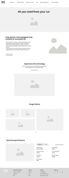
As we entered the UX phase, based on the insights gained from the research, i created the wireframes for the website so we can start showing the client the flow we wanted to create for the website.


The design
There’s no place like home
The biggest emphasis we wanted to apply for the homepage is balance and movement. Placing the different parts in an order that creates a precise customer journey, which empowers the users and boosts both sales and brand awareness.


Different events, different needs
One of the must important elements for the client was the emphasis on the events, therefore we decided to create a main page for all events (past & future), and anther specific page layout for each event, so the customer can sense that its not just a very nice car but also there is a growing community around it.
.png)
.png)
Anybody here?
As its a new brand in France, it was very important that the FAQ page will be as detailed as possible, with selected questions, a map section to provide all the necessary focal points, and some content about the car.
By covering all that information we assumed the customer will find his answers without getting frustrated and leaving.


Hello dear
We created a page which is a somewhat introduction of the Aiways new model, therefore we decided to have a few sections with pictures, videos ,texts and some more technical information, so the potential user will receive all the necessary information he needs and hopefully will lead them to purchasing the vehicle.


Mobile
The main goal in the responsive mobile redesign is to maintain the same design style of the desktop version and make navigation as easy as possible for the user.
.png)

.png)
.png)
.png)
